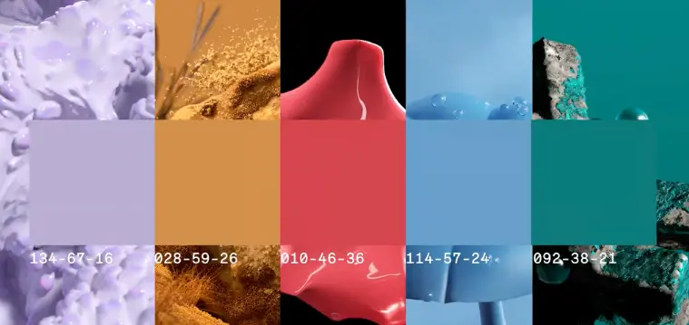
Want to use the newest colour trends to adorn your home? We’ve compiled the most intriguing hues predicted to rule interior design for this year, along with tips from knowledgeable authorities on how to employ them in your house.
Understanding color trends is the foundation of all interior design decisions, and researching the newest colour trends can help you select the ideal palette for your space. You should also check the colour wheel, fundamental colour theory, and current paint trends.
Color evokes strong emotions in us, and we have strong emotional connections to particular hues and tones of colour. The excitement you get when you see colour and pattern combined in an artful way that makes your heart somewhat sing is added on top of this. The thing that lifts all of our spirits is experiencing something new, strange, or unexpected.
There is something for everyone, regardless of style, in the upcoming year’s color trends since they are both fearless and composed, powerful but calming, and they celebrate both lovely brights and cosy neutrals.

What is the meaning of color trends?
A trend in colour is a way of going. It’s a growing understanding or a beginning liking for one or more hues. As a result, a colour trend may alter our perception of a hue and our choices when making purchases of consumer items. In other words, colour is a medium that we use to communicate continually.
In anticipation of future trends, color trends forecasters look to cultural markers in the fields of travel, art, technology, fashion, sports, and entertainment. Every year, colour trends spread throughout the industry, which is why it appears that sectors as disparate as fashion, interior, automobile, and technology are essentially on the same colour wavelength.
The colours that will soon characterise a home’s elegance have undergone a clear alteration as a result of the change in seasons. This season’s color trends are understated, thoughtful, and totally committed to giving your interiors a lifestyle feel. Here are the 11 main colour trends for this season that capture its feelings.
11 Color Trends for your Interiors
#1 Pistachio
With the current trend for dark, forest greens fading into delicate sage greens and this soft tone of pistachio, pistachio is carrying a kick right now. Due to its associations with the past, this green loses any hint of its coolness and becomes a cheerful and upbeat color trends. In recent years, there has been a drive towards going green. Dark green has taken centre stage, but this style will eventually evolve to include softer, more delicate greens like pistachio. The delicate elegance of pistachio is enhanced by the fact that it has a complex colouring that goes well beyond merely blue and yellow.
#2 Mushroom Grey
Keep an eye out for mushroom grey to make a splash in this year. It is a fashionable hue with origins in nature and a warmer companion to classic grey with warm undertones.
The trend towards organic colours is a reflection of our shared desire for serene, tranquil, and cosier surroundings. Particularly, there is nothing like an earthy living room to calm the soul.
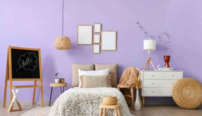
#3 Lavender
Purple has restored our passion for it. Shades of purple in color trends have long been linked with riches and royalty when used in fashion and interior design. While many people would think of conventional interior design when they think of the hue, designers are now using it to create new, modern aesthetics, giving the colour a fresh new feel.

#4 Cosy Beige
Neutral colours are now again popular, particularly in bedroom designs where they assist to create a relaxing atmosphere and a haven from the outside world. Warm, earthy white colours offer depth to the space when combined with terracotta or deep red tones.
Keep in mind that layers of texture provide tactility and intrigue to neutral colour schemes, giving the room a unique sense.
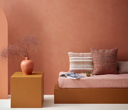
#5 Paprika
We are happy that the terracotta style has evolved into paprika and will remain popular. Choose vivid variations of the hue from color trends this year to make your property stand out.
When paprika is blended to produce a lovely tonal effect and is paired with neutral textiles and linens, the result is a well-balanced, upscale style. It is a stunning alternative for this design and gives the space liveliness.

#6 Summery Warm Colors
Colors like yellows, tangerines, pastel purples, and baby pinks—which in the past might have seemed a little too sweet—are now dominating interior design in a really sophisticated, mature way. Even when utilised on four walls, the more subdued versions of these colours are surprisingly livable.
As we consider the future color trends for this year, there are a number of hues that immediately come to mind, including pinks, oranges, lavenders, purples, and greens. As many of us have had difficulty enjoying a true summer or taking vacations this year, individuals are choosing deeper tones that add cheerfulness and warmth to their homes and bring the summertime mood inside.
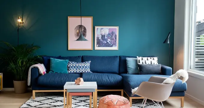
#7 Shades Of Rich looking Blue
Every year, blue appears in color trends, but in a somewhat different shape. We are drawn to it year after year since it is such a calming, well-known colour, and this year, deep blues appear to be the most in style. The deeper colours should be fully embraced, not merely added to a neutral area with furniture or a focal wall, but rather used throughout the entire room to create a dramatic and cosy atmosphere.
It could take some time for you to become used to the colour blue after painting a room that colour. You’ll probably be terrified. It’s challenging for people to adapt to change. After a week, your emotions will change.
If you don’t think you’ll find it repulsive, and even if you do, repainting isn’t that difficult. Although it is common knowledge that white paint makes a room appear larger, if you are still apprehensive, start your change in a cloakroom or tiny bedroom because richer colors trends work well in such places.

#8 Dark Jewel Tones
When it comes to color trends, the dark and gloomy hues are still in the lead. This time, it’s employed to define a space in an exquisite way by emphasizing stairways, decorative windows, or woodwork. The fashionable deep charcoal greys and blue-blacks can be replaced with a warmer and more eye-catching deep plum or black with a red undertone. It enhances colder colour schemes and harmonises wonderfully with pink and neutral tones.
#9 Neutral tone of Stone
The neutral trend is slowly shifting away from conventional creams and cool greys and towards warmer neutral stone tones. Consumers are adopting warmer, more natural hues in order to create cosy settings that seem familiar, intimate, and cosy.
Soft inviting greens and earthy, stonier tones are becoming more and more popular, offering a soothing alternative to colder options. These soft neutrals may be utilised throughout the house to bring warmth and serve as a chic, complimentary backdrop for textiles, wall coverings, and furniture of all kinds.
#10 Heritage Inspired Hues
Richly saturated colors trends will produce cosy, calming, and welcoming environments. We’ll see a lot of deep blues, putty pinks, and rich reds with explosive magenta overtones among the reinvented historical hues. Following these color trends you can also shop interior related stuff from Greh Sajjaa.
The resurgence of these historic, classic hues is not just restricted to more conventional, period homes; they will also be used into stunning modern settings, creating a unique fusion of the old and the new.
They vary from simple, usable lights to powerful, moody darks, all of which add even more relevance to our palette for enjoying and sharing our homes.
#11 Consider Traditional Color Combinations
Expect to see more daring color trends combinations and unusual colour pairings in interior and colour trends this year as a result of our willingness to take greater and bolder chances with colour.
The cosy space is given a burst of freshness by this fun colour scheme in reverse. The drapes and cushions have a solid orange trim that frames the cloth and gives the room a unified look.


[…] Colors: Most mood boards feature the design’s colour palette, which can be presented as swatches or incorporated into photos and other design components. […]